
My Hyundai Case Study
My Hyundai app design project aims to enhance user experience, streamline functionality, and integrate new features for Hyundai electric vehicle owners. This initiative focuses on modernizing the app's interface, improving usability, and incorporating feedback from existing users.
Time
June 2024 – July 2024
Role
UX Researcher
UX Designer
UI Designer
Design System Specialist
Team
Personal Project
Tools
Figma
Photoshop
Discipline
UX/UI Design
UX Research
Graphic Design
Interaction Design
Design Systems


Pain Points
Complex user engagement
Important features like setting timers or remote control functionalities should be more prominently displayed and easily accessible within the app interface, rather than buried within menus.
Interface not
user-oriented
Users often find the app's navigation confusing and non-intuitive. Improvements in organizing menus, simplifying interface elements, and enhancing visual hierarchy could help users navigate more seamlessly.
Incompatible with all devices
Ensuring consistency in design and functionality across different devices (e.g., smartphones, tablets) and operating systems (e.g., iOS, Android) is essential for providing a cohesive user experience.
Accessibility issues
Some users have mentioned accessibility challenges, such as small font sizes and unclear button placements, which can hinder usability, especially for older adults or users with visual impairments.
Summary
The My Hyundai app is well-received for its convenience and utility, but there are opportunities to improve usability, feature awareness, and user trust. By addressing these areas, the app can deliver an even more seamless and personalized experience, better meeting the needs of Hyundai vehicle owners.
Persona

Denzel - "Live simple and dedicated"
Denzel is a 50-year-old finance professional who isn't very tech-friendly. He needs a straightforward, easy-to-use app for managing his car. The app should have a simple interface with large, clear text and intuitive features to help him navigate it effortlessly. Denzel values practicality and simplicity, requiring a tool that supports his daily life without adding complexity.

Dina - "Do what you love and live to the fullest"
Dina is a 30-year-old tech-savvy professional who juggles multiple roles as a yoga teacher, blogger, and digital nomad. She lives with her dog and relies heavily on her computer to manage her work. Dina’s lifestyle requires an across-platform solution that seamlessly integrates her various activities and keeps her organized. Since she sometimes works from her car, monitoring battery life is crucial to ensure her devices are always ready. She needs a system that adapts to her on-the-go, multi-tasking life, allowing her to stay productive and maintain the flexibility that her lifestyle demands.
User Journey Map Denzel

Denzel - Accessibility
Overall, the journey starts positively but declines as the user encounters challenges with the app's interface and functionality, leading to frustration and dissatisfaction.
User Journey Map Dina

Overall, the user's experience starts with high expectations but quickly turns to disappointment as they encounter issues with the app's design, usability, and functionality. This leads to regret over their purchase decision.
Paper Wireframe
To enhance the My Hyundai app by making it more intuitive and providing a seamless user experience.

Lofi - Wireframe
The design has been refined from the initial paper wireframe to better address the challenges identified during the research phase. These updates enhance usability, streamline navigation, and ensure the app effectively meets user needs.


Lofi Prototyping
Based on the user research, there was a significant problem for the elders who cannot see texts in the app. Moreover, there is a customizable widget including 4 customizable spot for function keys.
Findings
Too complicated screen
Too many features are cluttered on a single screen; it would be more effective to organize them by function across separate screens.
Not everyone wants same keys for functions
Not everyone prefers the same keys for functions. It would be better to allow users to customize their key preferences.
Not suitable for dynamic font size
Some layouts are not responsive to dynamic font size changes, leading to poor scalability and accessibility.
Summary
In the usability study, feedback highlighted several areas for improvement. Users found that too many features were cluttered on a single screen, suggesting that organizing them by function across separate screens would enhance usability. Additionally, not everyone prefers the same keys for functions, indicating that allowing users to customize key preferences could improve their experience. Lastly, some features were rarely used, leading to the recommendation of prioritizing frequently used features or enabling users to hide less relevant ones for a more streamlined interface.
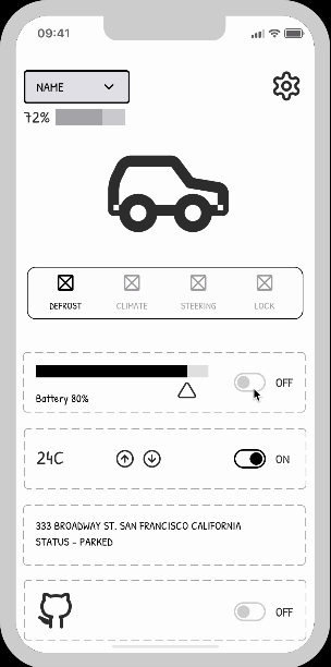
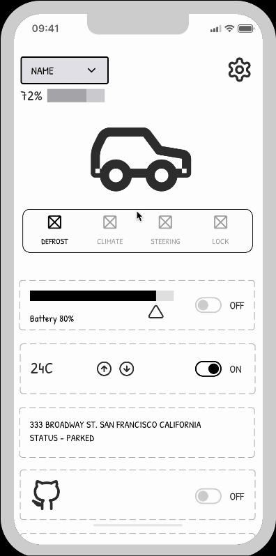
Mockups
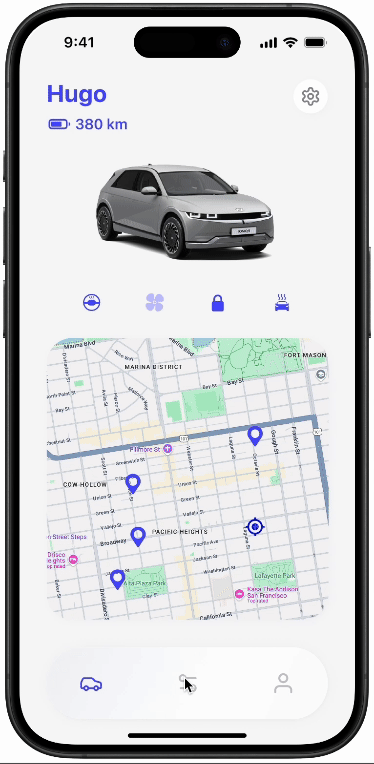
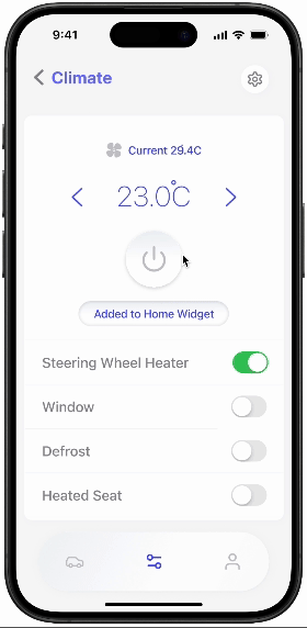
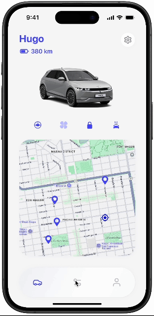
The mock-up screens are designed with a strong focus on the key pain points identified from the user journey, particularly in the areas of accessibility, customization, and UX/UI improvements. To address accessibility, the design incorporates responsive elements, ensuring users can easily interact with the app regardless of device or font size preferences. Customization options allow users to tailor key settings, such as layout and function, to fit their individual needs. The refined UX/UI focuses on a cleaner, more intuitive interface, streamlining the user experience and eliminating unnecessary complexity. These improvements directly target the issues users faced in earlier stages of the journey.

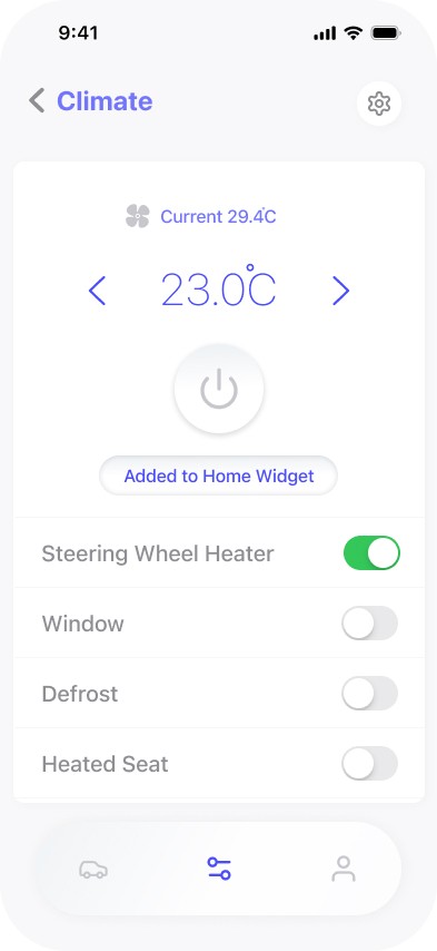

The text-heavy mobile app has been enhanced with universal icons and functional buttons, allowing for a more customizable experience through widget-style features.
Customizing the buttons
It allow users to personalize their interface by assigning frequently used functions to easily accessible buttons. This enhances efficiency and user experience by enabling quick access to essential features with minimal effort.

Personalize the App
The widget function on the home screen allows users to access key features and information quickly without navigating through multiple menus, improving overall efficiency and user convenience. It enhances the user experience by offering instant, customizable access to frequently used tools and data.
Visual feedback
The app now includes visual feedback for its buttons, providing users with immediate confirmation that their actions have been recognized. This enhancement improves user confidence and interaction efficiency, addressing the previous version of the app, which lacked this crucial feature and often left users uncertain about whether their inputs were successful.
Various font size
The app offers adjustable font sizes to enhance accessibility, allowing users to customize text to their preferred size for better readability. This feature addresses one of the crucial problems identified in user research, ensuring the app is more inclusive and user-friendly for individuals with varying visual needs.
UX Insights
Initially, I planned to use a one-page app screen, but I switched to a navigation-based app style to create a more organized experience. By adopting a navigation structure, I was able to categorize content into distinct sections, making it easier for users to find specific information and complete tasks without feeling overwhelmed. This approach also benefits a wider range of users, particularly across different age groups, by offering a clear and intuitive path through the app's features.
UI Insights
As I progressed with the design, I found myself trying too hard to stick to the original branding of the app. I became overly focused on maintaining Hyundai's image, which made the design process more challenging. While focusing on consistency, I neglected to properly implement color hierarchy, leading to an overuse of grey. Additionally, in trying to align every aspect of the design, I ended up attempting to make the containers identical to the navigation, which caused unnecessary design uniformity.
Previous


Next


A planner for travelers